14.10.21
Design psychology – 6 tips to improve your website
4 minute read

Did you know that our brains rely heavily on mental models and patterns, taking shortcuts to minimise thinking time? Put simply, we all make unconscious assumptions, particularly when it comes to the vast amounts of visual information we have to process.
That’s why having an understanding of design psychology in marketing is handy: it allows us to design for minds on auto-pilot. Here are 6 useful tips you can apply to improve your website for our effort-averse brains.
1. Keep it simple
When people land on your site they want to know, very quickly, who you are and what you do, so tell them. Be clear with your message and ensure you position your business effectively. It’s no surprise that research confirms that clean, minimalist websites are often the best performers.
Straightforward navigation – from menus to drivers – coupled with crisp copy and a consistent visual identity will help deliver journeys that customers (specifically their brains) enjoy.

Also, consider the principle of proximity. We perceive objects clustered together as being related to one another, so ensure that related items are grouped and also, importantly, leave plenty of space between content that is not related. Designers love white space for a very good reason, it’s breathing room for our brains.
2. Use compelling imagery
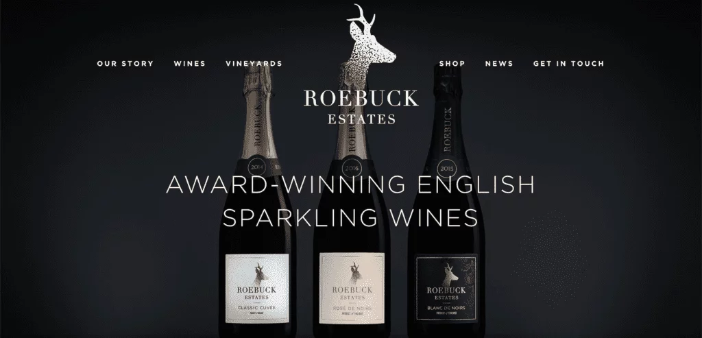
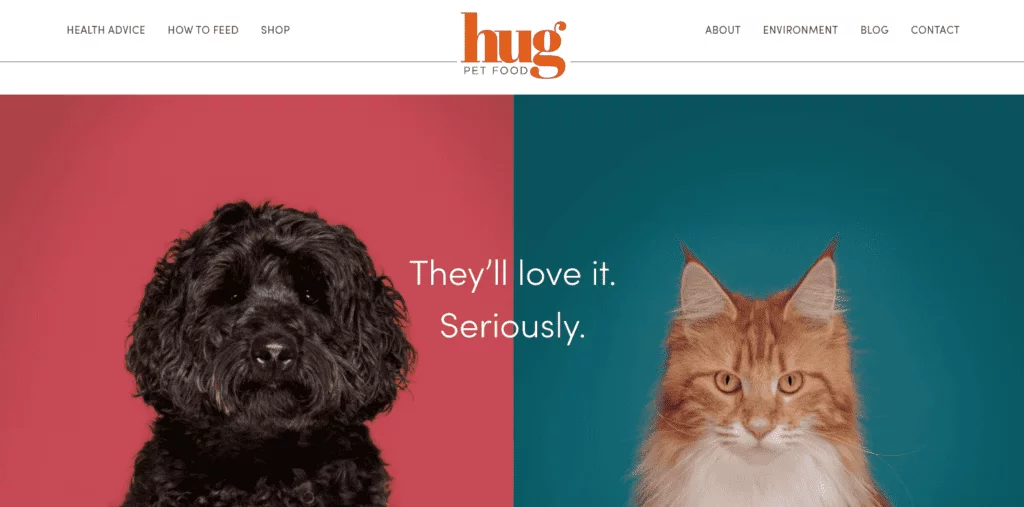
This tip is no surprise, after all, a picture paints a thousand words. Images act as instant storytellers, they can powerfully communicate emotion and thought in no time at all. You can capture your customers’ attention by using a well-placed, attractive image.
Visitors to your website will ‘read’ the images and in a split second, make a decision whether or not the rest of your website is relevant to them. So take your time to find high-quality imagery that not only communicates what you want but also sends the right messages about your business.

3. Contrast, colour & CTAs
Using pops of colour and designs that utilise contrast is important for a brain-friendly website. According to the isolation effect, when we are shown multiple objects, the one that stands out is the one we’re likely to remember.
When faced with designs that lack visual contrast, we’re less likely to remember vital aspects. Making useful information distinct via differing colours, positioning, size, and shape can help it to be absorbed more easily.

When it comes to the all-important Call to Action (CTA) buttons; ‘contact us’, ‘buy now’ or the ‘free 14 day trial’ shown in the zPlan site above, there are some broad colour rules. The best colours for CTAs are those that tend to evoke positive emotions. Red, green and orange are considered good colours; red evoking urgency, green being reassuring and orange being warm and happy. Less good colours, the more emotionally passive colours, are white, black and brown.
4. Content hierarchy and the F-shaped path
Eye-tracking studies have shown that when we browse a website for information, we often scan in an F-shape. We start at the top, shift to the right, then sift downwards, searching the page for useful imagery or text. Try to avoid putting key information at the bottom right of a page – most visitors are less likely to reach it.
Also, consider content hierarchy. Your average visitor will only read roughly 20% of your web page, so make sure you communicate the important things first, your key content needs to be top of your page with strong visual prominence, you can then move on to the ‘detail’ later, for those more patient visitors!
You can also break up the content of your pages to make them more scannable using:
- Carefully crafted subheadings
- Thematically ordered paragraphs
- Bolded keywords
- Lists
- Columns
5. Pair words with images
According to dual-coding theory, a blend of verbal and non-verbal information makes it easier for us to remember data. Verbal information and non-verbal information are sorted using different cognitive systems, so communicating information to both systems helps people shape correct mental models.

6. Embrace centre-stage
When we’re shown a range of similar items, we tend to prefer the one in the middle – this is called the centre-stage effect. This is a beneficial concept to consider if you’re designing visuals to promote a product or service – be it in email marketing, on your website, or in an ad.
If you’re trying to drive the sale of specific items or services, curate your website journey accordingly. For example, a promotional shot could feature several products, carefully positioned around a central item – the one you want customers to gravitate towards.
Did you make it…
If you made it this far down the post, your brain is in excellent shape, great job! You did so much better than those cognitively idle so and so’s who only read 20%, scanned the rest in an F-shaped pattern and looked at the pictures… 🙂

