27.08.20
Premium label design for Roebuck Estates

2 minute read
Recently, we were commissioned to create a luxury label design for the newest addition to the Roebuck Estates portfolio: Blanc de Noirs 2015.
Roebuck Estates is an award-winning producer of English sparkling wine, lauded by wine critics in a multitude of reviews.
Here at Resolution, we enjoy nothing more than a fully integrated creative project. We joined forces with Roebuck at the very beginning, designing the brand, website, product labelling, and collateral. We previously created label designs for their award-winning Classic Cuvée – both the 2013 and 2014 vintages.
Watching this brand grow – and tasting their exceptional wine – has been a joy.
Label design inspired by West Sussex beauty
Roebuck Estates is a quintessentially English brand – with world-class standards.
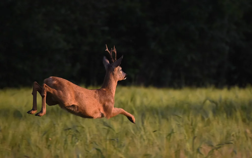
Nestled in the rolling downs of West Sussex, their estate-grown fruit ripens within four stunning Roebuck-owned vineyards. The brand takes its name from the deer that roam across the estate’s landscapes.
This rural aesthetic was central to our brief for the Blanc de Noirs label.
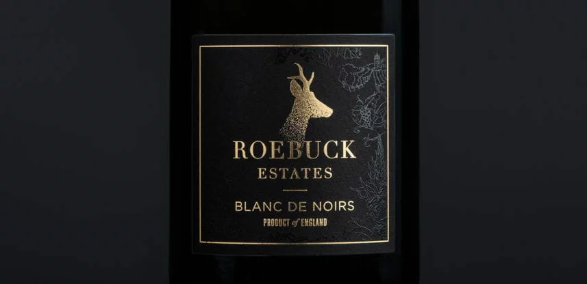
Just as Rosé is distinguished by pink-hued labelling, Blanc de Noirs is traditionally adorned with black labelling, due to the dark grapes used to produce the wine.
We wanted to reflect the charming wildlife and countryside against a black backdrop.
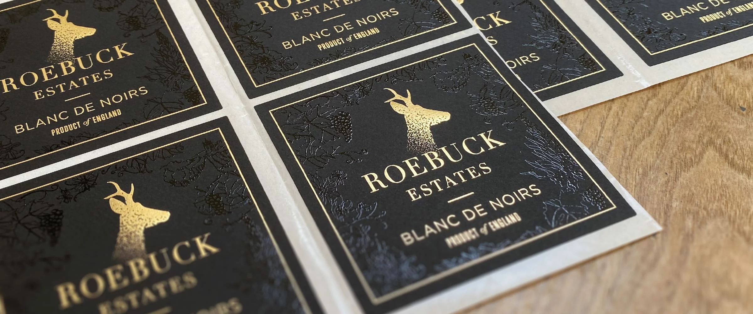
A local artist, raised print, and gold foiling
We’d worked with Jo Beal previously and felt her beautiful illustrative line style would elegantly enhance the Roebuck label.
We commissioned her with a brief to create an illustration inspired by the West Sussex countryside. This featured details such as the inclusion of wildflowers that grow in abundance around Roebuck’s estates.

Once Jo had produced some sketches, we began the complex process of refining and testing elements of the label design to ensure they worked with the raised print process.
This method brings out Jo’s design against the label’s matte black surface, a refined gloss decoration that reflects the luxury of Roebuck’s Blanc de Noirs. We then complemented this with gorgeous gold foiling.

Once tests were run and final touches had been made, the product was ready: a subtle yet striking label with a premium feel. The perfect match for Roebuck’s Blanc de Noirs.
More Roebuck delight – and another label design
Since Blanc de Noirs 2015 launched, Roebuck has announced the impending release of their Rosé de Noirs, featuring another Resolution-designed label. We can’t wait to try it.
There’s also talk of a Magnum, but for now, we’ll simply say watch this space…