Home Resolution Design Logo A white variation of the Resolution Design Logo All-black version of Resolution Design Logo.

Resolution

  • About
    Back
    • Team
    • Careers
    • Our process
    Welcome to Resolution Design
  • Services
    Back
    • Branding
    • Websites
    • Digital marketing
    • Graphic Design
    • Web Applications
    • Hosting & support
    • Marketing consultancy
  • Work
  • Insights
  • Project request
    Contact
  • When is the right time to rebrand?

    12.02.21

    When is the right time to rebrand?

    by Richard

    4 minute read

    We all know the saying if it ain’t broke don’t fix it. Building a solid, memorable identity requires money, time, and energy, so embarking on a rebrand is a big decision.

    Why then do even the very biggest businesses take flight and go for it? Because, sometimes, the moment has come to accept that customers are not engaged with key aspects of your business personality. Sometimes, you have to acknowledge that your brand power is failing and act on it.

    We’ve helped many businesses successfully reboot their brands. In this piece, we’ll walk you through some common reasons to consider a rebranding.

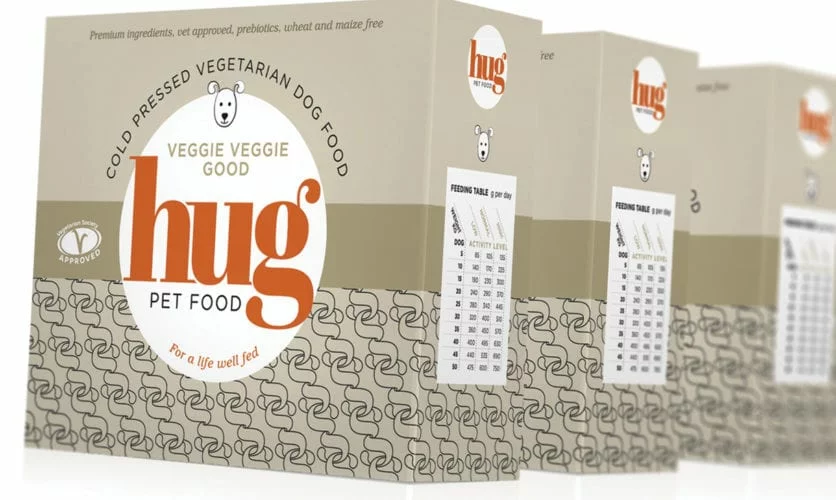
    Reasons to consider a rebrand

    We’ve talked about Gap’s logo redesign disaster before. Tropicana lost 20% of its revenue in just one month after a poorly conceived identity shift.

    an orange in water

    Done right, a timely rebrand can be hugely beneficial to your business, upping your brand recognition, winning customers, and boosting revenue.

    So here are 6 compelling reasons to commit to a rebrand…

    1. Do I have a brand?

    It’s possible that you have not really considered ‘brand’. You may never have been through a ‘branding process’. What you do have is a brand that, like all brands, is defined by the many and various ways you interact with your customers.

    If you have not yet looked to clearly define your brand, or to clearly communicate what you are all about, you’re missing out a big marketing opportunity.

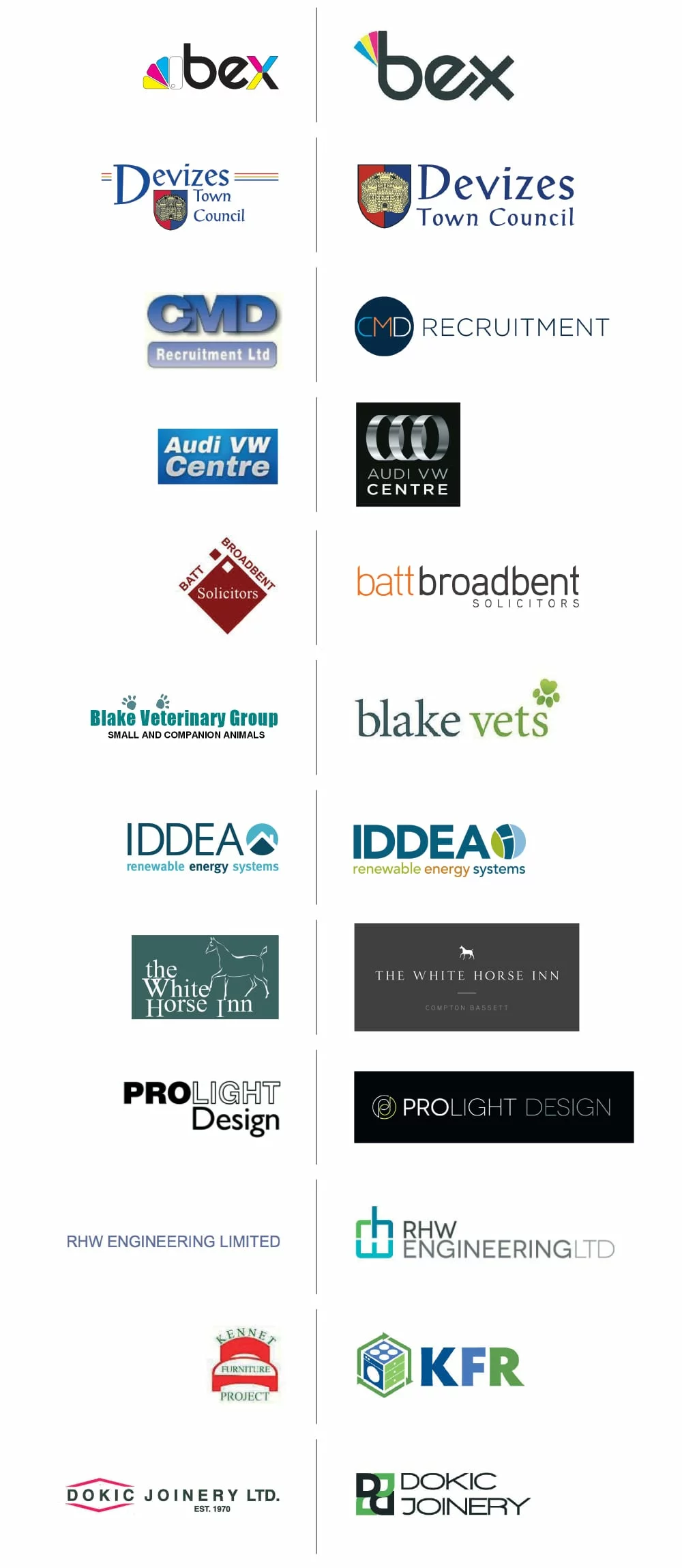
    2. Your brand is dated

    Yes, some traditional brands have used the same logo for hundreds of years to excellent effect. But, for most businesses, staying relevant over time requires brand change.

    If you look at your logo, your marketing materials, and other important customer touchpoints, and you feel your business looks dated, it’s a glaring sign.

    Perhaps your current brand identity was shaped when you were starting out on a shoestring budget. Perhaps it was created many years ago and no longer reflects the business as it stands today. Perhaps it isn’t applying well in today’s digital-first world.

    3. Your strategy has shifted

    You’ve seen an opportunity to focus on a new audience… and realised they’re unlikely to connect with who you are now. You want to win over new customers without alienating your existing client base, so are looking to strengthen your look and shift your market positioning without sacrificing your original appeal.

    group of friends laughing

    Alternatively, you may be thinking about changing the service or product range you offer, and feel your brand needs a revamp to reflect this.

    4. You’re failing to stand out

    When the market you’re competing in gets crowded, you’re less likely to stand out – especially when brands that look and sound similar to you start cropping up. To counter this, you need to effectively communicate that your offering is unique; in this instance, rebranding in some form is necessary to bring your point of difference into focus.

    pencils

    5. Your values aren’t translating

    The modern customer is increasingly drawn to purpose-led brands with a tangible mission… but the core values driving your business aren’t being articulated via your brand identity. If so, it may be time to reevaluate everything – your mission, your look, your tone of voice, your strategy – to more powerfully convey your reason for being.

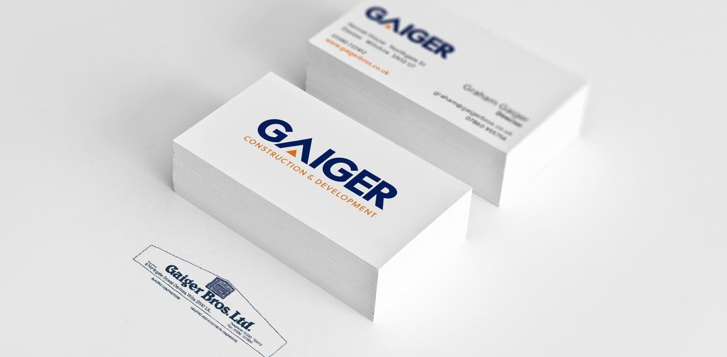
    6. Your business has grown

    If your business has undergone a merger, takeover or moved into new markets, a rebrand may be in order. Your identity may longer fit with your expanded offering and audience, or, in the case of a merger, you may need to thoughtfully combine your existing identities into a unified whole.

    How to rebrand

    Ok, so you’ve decided rebranding is the way forward. What next?

    An airtight rebrand requires strategic consideration, sensitivity, creative flair, and, above all else, a genuine understanding of your business, your customers, and your aims. Get these right, and the finished product will be a brand with lasting impact and a loyal, growing audience.

    Look out for part 2 of our insights on rebranding… Next, we discuss our in-house process and the consistent, impactful application of your brand.

    previous Post

    The value of a great logo design

    next Post

    Tips to ensure a successful rebranding

    let's get the ball rolling

    get in touch
  • The value of a great logo design

    28.01.21

    The value of a great logo design

    by Richard

    4 minute read

    Gaiger Business cards

    Amidst intense competition on and offline, a unique logo is a powerful visual calling card, designed to set you apart, cultivate customer recognition, and grow loyalty.

    In this piece, we discuss the impact of a great logo design – and the thought process behind it.

    Logos, memorability, and consistency

    Worldwide, 94% of us recognise Coca-Cola’s logo. Even toddlers know the golden arches of McDonald’s and the Nike Swoosh. When it comes to memorability, your logo is an incredibly valuable asset.

    It takes roughly 5 to 7 impressions for someone to remember a brand. Your logo is easy to apply across multiple channels, making it a clever means of quickly imprinting yourself on a customer’s memory – especially given that our brains are wired to process visuals 60,000x faster than text.

    BP splashed out over £150m on a new logo, with the understanding that a strong visual identity equals increased revenue.

    Profits can be boosted by 23% when brands are presented consistently across every platform; your logo can be seamlessly featured almost anywhere you appear: a short-form ad, social media, product packaging, the side of a van, a business card – wherever. It brings uniformity and, over time, instant brand recognition. In terms of talent, it helps attract good candidates for your team and fosters employee pride.

    starbucks paper cup

    Shaping brand perception

    You have a tiny window to project a compelling brand image. Our brains are pretty quick assessors: it takes a mere tenth of a second to form first impressions of people, and only one-twentieth to judge a website. Subsequently, your logo plays a pivotal role in shaping perceptions of your brand identity, whether you’re launching a new business or rebranding.

    Apple’s logo reboot in the 90s is seen as fundamental to its shift from failing company to household name. It personified the sleek minimalism Apple is now synonymous with – and helped foster some serious brand love. Big players such as Starbucks and Instagram are among many others to have undergone logo redesigns to change brand direction.

    apple macbook - silver

    From the type of design you choose (wordmark, pictorial, combination mark, etc.) to its colour and shape, your logo is a visual personification of your brand.

    Looking to present a modern, professional image? Then perhaps you’d opt for a neutral, pared-back design. Want to come across as warm and playful? Selecting a rounder, softer design in a vibrant shade might be best.

    After you’ve nailed your brand ethos and point of difference, you can start thinking about your logo.

    Our logo design process

    The best logos have careful thought and research backing them. We’ve designed over 350 beautiful logos here at Resolution, so we like to think we know what makes a good’un.

    Typically, we craft a logo design as part of a full-scale branding application. Clients tend to approach us for one of two reasons: they’re starting a new business and want consistent branding, or they feel their current brand identity needs a reboot.

    gaiger business cards

    The beginning

    It all starts with a conversation about your offering: your USP, your competitors, your audience. Once we’ve understood this, we might do additional research on your industry, to better assess your positioning.

    Creation phase

    Next comes the super creative part. We’ll sketch out our ideas for logo designs reflective of your brand identity.

    We work hard to conceptualise an exclusive logo that is highly relevant to your business, considering application and usage within a range of contexts. This might lead us to a wordmark logo, or it might involve graphical elements: it all depends on your business.

    We’ll whittle our designs down into a small shortlist, which generally includes a choice of 2-3 logos – the strongest contenders.

    Final steps

    Next, we show the logo designs to you in various applications. Once we’ve received your feedback, there might be one or two rounds of changes to refine your chosen logo, so it perfectly fits your vision.

    HUG

    The process ends with the delivery of spec sheets detailing brand colours, fonts, and your logo design in different formats – social media icons, letterheads, jpegs, and more.

    Using an agency for your logo design

    Your company’s visual identity doesn’t start and finish with a logo. It’s part of an overarching brand application and story.

    Beyond designing your logo, an experienced agency can act as a guardian for every element of your brand, helping you navigate challenges while maintaining a consistent look and voice.

    Sometimes, situations may arise that necessitate changes to your visuals. For example, you may wish to use your logo in a new application – perhaps on a sign or vehicle livery. We assist you in ensuring any adaptations remain true to your brand – rather than dilute it. This is how the strongest brands are built: ones people know, remember, and love.

    A new logo can give your brand a fresh leash of life and recast you as serious competition. To wrap things up, here are just some of the logo redesigns we’ve done over the years…

    logos before and after

    previous Post

    Top 5 Brand Design Trends for 2021

    next Post

    When is the right time to rebrand?

    let's get the ball rolling

    get in touch
  • Top 5 Brand Design Trends for 2021

    18.01.21

    Top 5 Brand Design Trends for 2021

    by Richard

    3 minute read

    Pencils lined up

    As we know, art imitates life – and so too will the design trends for 2021. After a year in which everyday life as we knew it had to be reimagined – fast – we expect 2021 will see the impact of this mirrored in brands’ marketing and designs.

    Here’s our forecast of the top 5 design trends to look out for…

    1. Minimalism

    Minimalism is one trend that’s here to stay. This is largely due to customers’ changing relationship with technology and brands, set against a backdrop of intense online competition.

    People have grown accustomed to generously spaced, lightning-fast websites that deliver an intuitive user journey; they’ve tired of roadblocks such as incessant pop-ups, waffly content, and over-stuffed menus (check out our thoughts on those here).

    screengrab of resolution website homepage

    Moreover, mobile devices account for roughly half of global web traffic. A vast proportion of us opts to visit a brand’s site via smartphone – even more so during the pandemic. This necessitates a simple design that adapts well to small screens.

    Email marketing workflows are quickly becoming a staple of a well-designed customer experience. Sticking to clean, succinct layouts and messaging helps your email command attention in an increasingly noisy inbox.

    2. Going retro

    Is it any surprise that we’re all feeling a little nostalgic at the mo? Looking back on rosier times is all the rage right now, and, as a result, we’re seeing a shift towards classic designs.

    Many brands are opting for retro serif fonts and colour palettes. Aside from looking beautiful and catching the eye, these vintage styles instil a sense of comfort and trust associated with a bygone era, evoking positive emotions in the customer and capturing their attention.

    3. Eco-consciousness

    As environmental awareness continues to grow, sustainably-minded design is establishing itself as the new norm. Our collective reconnection with nature during 2020 and the green impact of lockdowns have only accelerated this.

    Customers now expect packaging to be designed with a no-waste philosophy in mind – minimal or zero plastic plus straightforward recycling instructions.

    On a broader scale, we predict that more organic, natural themes will seep into brands’ designs this year: softer, earthier tones and textures, illustrations of natural beauty, and hand-drawn elements for a more authentic, human touch.

    roebuck logo design

    4. Immersive imagery

    Big names such as Apple have been harnessing the power of hyper-tangible, 3D imagery for some time now – and smaller e-commerce brands are following suit. These images aren’t just impressive signals of modernity: they engage the viewer and powerfully impress a product on the memory.

    As the line between physical and digital continues to blur and technology advances, we expect to see brands harnessing even more lifelike visuals to advertise their products – on their websites and within their email marketing.

    hug packaging boxes

    5. Playfulness

    We’re all looking for a little levity right now. Subsequently, we reckon fun, creative flourishes will appear in abundance in 2021 designs.

    Clever use of geometric shapes in blocked colours, cartoons, and subtle animations will be used to enliven and complement minimalist designs, directing the reader’s attention to critical points, improving readability, and reducing cognitive legwork.

    There may also be a move towards intentionally ‘imperfect’ designs, shaped to convey a brand’s authenticity and a touch of maverick thought.

    Design trends for 2021… Watch this space

    We hope you enjoyed our thoughts on the top design trends for 2021. Art and design are ever-evolving, so who knows what other trends may arise this year – we’ll be keeping our eyes peeled.

    previous Post

    Language psychology in marketing: 6 core principles

    next Post

    The value of a great logo design

    let's get the ball rolling

    get in touch
  • Premium label design for Roebuck Estates

    27.08.20

    Premium label design for Roebuck Estates

    by Richard

    2 minute read

    Roebuck label sheets

    Recently, we were commissioned to create a luxury label design for the newest addition to the Roebuck Estates portfolio: Blanc de Noirs 2015.

    Roebuck Estates is an award-winning producer of English sparkling wine, lauded by wine critics in a multitude of reviews.

    roebuck logo design

    Here at Resolution, we enjoy nothing more than a fully integrated creative project. We joined forces with Roebuck at the very beginning, designing the brand, website, product labelling, and collateral. We previously created label designs for their award-winning Classic Cuvée – both the 2013 and 2014 vintages.

    Watching this brand grow – and tasting their exceptional wine – has been a joy.

    Label design inspired by West Sussex beauty

    Roebuck Estates is a quintessentially English brand – with world-class standards.

    Nestled in the rolling downs of West Sussex, their estate-grown fruit ripens within four stunning Roebuck-owned vineyards. The brand takes its name from the deer that roam across the estate’s landscapes.

    This rural aesthetic was central to our brief for the Blanc de Noirs label. 

    deer in a field

    Just as Rosé is distinguished by pink-hued labelling, Blanc de Noirs is traditionally adorned with black labelling, due to the dark grapes used to produce the wine.

    We wanted to reflect the charming wildlife and countryside against a black backdrop.

    A local artist, raised print, and gold foiling

    We’d worked with Jo Beal previously and felt her beautiful illustrative line style would elegantly enhance the Roebuck label.

    We commissioned her with a brief to create an illustration inspired by the West Sussex countryside. This featured details such as the inclusion of wildflowers that grow in abundance around Roebuck’s estates.

    jo drawing in a field

    Once Jo had produced some sketches, we began the complex process of refining and testing elements of the label design to ensure they worked with the raised print process.

    This method brings out Jo’s design against the label’s matte black surface, a refined gloss decoration that reflects the luxury of Roebuck’s Blanc de Noirs. We then complemented this with gorgeous gold foiling.

    drawing in a sketchbook

    Once tests were run and final touches had been made, the product was ready: a subtle yet striking label with a premium feel. The perfect match for Roebuck’s Blanc de Noirs.

    More Roebuck delight – and another label design

    Since Blanc de Noirs 2015 launched, Roebuck has announced the impending release of their Rosé de Noirs, featuring another Resolution-designed label. We can’t wait to try it.

    There’s also talk of a Magnum, but for now, we’ll simply say watch this space…

    previous Post

    We’re a Google Partner: here’s why that matters

    next Post

    Credibility and connection: the power of the Loyalty program

    let's get the ball rolling

    get in touch
  • The fall and rise of email marketing

    22.06.20

    The fall and rise of email marketing

    by Richard

    5 minute read

    Back in May 2018, what feels like a lifetime ago, GDPR came into effect. Positive, verifiable email marketing signup became a legal requirement, and most company list sizes shrank hugely. Was this the demise of email marketing?

    Well… no. Borrowing from the wonderful Mark Twain, ‘the reports of my death are greatly exaggerated.’ Email marketing took a hit but bounced back, and since the pandemic, brands have sent 27% more emails in a bid to reach out to customers. The number of emails sent from the Resolution email marketing platform has increased by more than 250% over the past 3 months, and open rates are soaring.

    working at a laptop with a coffee

    These extraordinary figures are driven by the demand for real-time updates during the COVID-19 uncertainty and a desire to keep us all informed and engaged while we’re more isolated. There’s also been a shift towards more sympathetic content: less ‘selling’, more education and entertainment.

    This surge drives home the continued role of email marketing as one of the most potent modes of brand communication. Done right, it acts as a unique conduit between you and your customers, building relationships via the delivery of intelligently targeted information.

    A few attention-worthy email marketing stats…

    • On average, email marketing generates £30 for every 80p you spend
    • By 2024, the number of email users worldwide is set to rise from 3.9 billion to 4.48 billion – half the world’s population.
    • 99% of customers check their emails daily.
    • Targeted emails generate 58% of revenue for businesses.
    • 59% of respondents claim marketing emails help shape their purchasing choices.

    Clearly, email marketing is a highly effective means of shaping and reaching your audience. Here’s a straightforward 3 step plan outlining how you can use it to grow customer engagement, remain memorable, and win new business.

    1. Create a clear strategy

    It pays to hone a solid email marketing strategy: the ‘what’, ‘to who’, and ‘how often’.

    Whether you’re sending a monthly newsletter, a product announcement, or content designed to simply entertain, carefully consider who should receive it and when.

    2. Grow your email marketing list

    You need to build a large, high-quality, GDPR-compliant list – essentially a list of people who actually want to hear from you. So, how do you do this?

    It’s vital to have prominent, attractive email signup on your website. You can also extend this to your email footers and other digital communications. Give people a good reason to sign up for your emails: the prospect of offers, insights and free information will help.

    Also, remember to ask prospective and new clients to join your list and promote your website/signup form when you can.

    3. Send attractive, personalised emails

    Your customers receive an average of 121 emails per day – that’s a lot of emails. This is why you need to make sure your emails look great and genuinely speak to your audience.

    It’s also critical to identify and understand your audience before you send your slick email marketing campaign – or you risk your content falling on deaf ears.

    Good emails are those that contain information relevant to your audience’s interests, needs, and circumstances – this is what engenders customer loyalty.

    In fact, 91% of customers say they’re more likely to purchase from brands offering personalised suggestions and deals, and 83% state they’re happy to share their data to enjoy a more bespoke experience.

    Now you know the basics. Next, you need a great email marketing platform to get you up and running. There are many out there, so when you’re looking, make sure that the platform you choose ticks the key boxes:

    • Built-in sign-up forms, website integration tools, and GDPR compliance options
    • Unlimited audience segmentation and audience lists
    • Excellent drag-and-drop design capability and template options
    • Comprehensive reporting on all aspects of your mailings
    • Great email automation tools and email workflows
    • Insight tools to guide future mailings
    • Integrations with other software tools e.g., CRM and e-commerce platforms

    previous Post

    A beginner’s guide to e-commerce

    next Post

    Lockdown Gallery

    let's get the ball rolling

    get in touch
  • The hidden influence of colour psychology on brand perception

    18.02.20

    The hidden influence of colour psychology on brand perception

    by Richard

    5 minute read

    Could switching your logo from aqua blue to cherry red really affect how customers feel about your brand? The short answer is yes. While any emotional forecasts made by way of colour theory are as ambiguous as a novelty mood ring, the impact colour has on customers’ purchase intent is pretty black and white.

    Research has repeatedly borne out the significant role colour plays in shaping our perception of a brand’s personality. It plumps up the magic duo: brand recognition and customer loyalty – a golden ticket for success in our blink-and-you-missed-it marketplace.

    You don’t need a doctorate in psychology to harness the full spectrum of potential that colour can yield. There are no cast-iron rules. All you need is a thorough understanding of what you want your target audience to infer from your branding.

    Once you determine your colour palette, it will inform the entirety of your visual identity. Replicating its secret formula within the design of your logo, packaging, website and marketing helps to portray your brand consistently across every channel. The outcome? Potentially boosting revenue by up to 23%.

    Not sure where to begin? Read on…

    Colour, strawberry mousse and brand recognition

    We’re all quasi-synesthetes, whether we realise it or not. Shades of the rainbow can taint everything from the taste of our food – a strawberry mousse tastes sweeter in a white container than a black one, didn’t you know? – to our bodily responses to the medications we take.

    Studies indicate that within the first 90 seconds of viewing a product, up to 90% of the subconscious judgement we make is shaped by its hue alone. On top of this, colour hikes up brand recognition by 80% when faithfully threaded throughout visual branding, and, let’s not forget, that recognition is intimately linked with customer confidence.

    Is any of this a surprise? 90% of information transmitted to the brain is visual, and it processes visuals an incredible 60,000x faster than text. Our brains don’t like working harder than necessary, so it’s clear why they have a soft spot for brands with strong identities: they’re simply easier to recall and recognise.

    A colourful personality

    To definitively claim that a particular colour will evoke a particular response, on a global scale, would be disingenuous. In the West, orange tends to stand for fun, zest for life and unbridled creativity – it positively fizzes with joy; jet over to many Middle Eastern countries and you’ll find it commonly symbolises mourning.

    Drilling down to a personal level, everyone has a unique set of preferences, influenced by an intricate mesh of memories and more. How, then, do you single out the ‘correct’ colours for a brand? By swapping ‘correct’ for context.

    Research has shown that when a chosen colour is deemed ‘appropriate’ for a brand’s positioning, it has a beneficial impact on brand perception, enhancing its desired image. What matters is that the customer views a colour palette as being congruent with what a brand is purporting to embody and offer.

    Consider Land Rover: their vehicles are designed to compliment and signal an aspirational yet rugged lifestyle, at one with the elements. The rich, verdant green of the iconic brand logo and vehicles encapsulates this and is echoed by a minimalist palette. If a shotgun rebrand took place, swathing everything in Mattel pink, many customers would see this as being way out of kilter with Land Rover’s persona and products.

    Of course, there are many shades of grey in the colour game. If you’re too on the nose, it can backfire or cross into stereotyping – see BIC’s pink and purple pens ‘for her’ blunder. If you’re too far off, you risk alienating your audience. It’s best to focus on aligning colours with the personality you wish to project, as this can make your brand more likeable and familiar.

    cadbury bar with no writing on the front.
    Camouflage is counterintuitive…

    Ok, you don’t want to get noticed for the wrong reasons, but hiding in plain sight isn’t a cogent corporate strategy, either. In a cutthroat marketplace on technological steroids, a solid, memorable persona is like gold dust, so, to stand out, you need to get creative with colour.

    Most of us can identify big brands by their distinctive colours alone. Players such as Cadbury know this, which is why they engaged in an expensive, years-long war with rival confectioner Nestle. They were battling to retain exclusive use of Pantone 2685C, their signature tint of regal purple, the mere sight of which conjures warm thoughts of chocolate, childhood and Willy Wonka.

    The Isolation Effect demonstrates that we are more likely to remember items when they stick out. Apply this to the competition: if you’re one of many architectural firms in a city, and the majority are using charcoal tones, why not claim new turf on the colour wheel? You don’t have to go wild, just offer a point of difference.

    Show your true colours

    If you feel like you’re drowning in an ocean of Dulux, worry not. Finding the right colour palette takes time, research and even a little soul-searching.

    Ask yourself what you’re all about. What’s the core personality, mood, and image you’re trying to convey? Consider your target audience and the nature of the industry you’re operating in.

    A skilled designer will take the time to sensitively decrypt your brand’s persona with you. Once they understand it, they’ll create an impactful visual identity to communicate it, crafting your logo, website design, packaging, and more.

    Strategy, targeted marketing, and copy are the bedrock of your brand’s tone, but exceptional design, governed by the right colours, is what makes you larger than life. Colour is the dog whistle of the marketing world, subliminally impressing an unforgettable image of your brand’s persona upon customers’ minds – one they connect with.

    Connection should always be the end goal because connection converts, converts and converts some more. Time to get the easel out.

    previous Post

    Business as a force for good

    next Post

    Marketing goes viral

    let's get the ball rolling

    get in touch
  • Bringing new brands to life

    19.06.19

    Bringing new brands to life

    by Richard

    2 minute read

    Our team in the Devizes studio have enjoyed many creative hours working on both national & international product launches over the last 12 months. Three, in particular, stand out – an international gin, an English sparkling wine and a luxury range of beauty products.

    In the very early stages of consumer brand development, creative consideration is given to logo ideas, mood boards, hand-drawn sketches, different shapes of bottles, stoppers, packaging, art, foils, wraps and embossing samples.

    roebuck labels

    Add to this the liaison with suppliers of all types and nationalities to make sure we have all the options in front of us, and the brand slowly starts to come together.

    Before this creative stage, however, some essential groundwork will have taken place. This consists of identifying the target audience and figuring out the brand positioning and messaging.

    We need to know who the potential customers are – where they live, how old they are, how they behave, where they eat, drink, socialise, what apps they use and any other insightful characteristics that will help us to tap into their needs, desires or aspirations.

    With the help of our clients, we diligently investigate what competitive brands are doing, keen to differentiate and find new ground. We aim to push the boundaries so the product will stand out.

    patterns on paper coloured

    From there, we distil this information into a key message that will resonate sufficiently to drive them to want to try the new product, or at least to find out more.

    For international products or those that intend to cross borders in future, consideration is given throughout the process to the different local cultures. Launching the gin in Hong Kong at the auspicious time of Chinese New Year, launching the English sparkling wine with plenty of reference to our green English countryside and wildlife, launching the luxury Mediterranean-inspired range of beauty products with all its accents in the right place. These are details that can make or break a brand.

    The result we are all after is a strong, unique brand, for a beautifully packaged product, aimed at the right audience, sitting confidently in its marketplace. And, of course, sales.

    previous Post

    Digital Agency Awards Finalists

    next Post

    Business as a force for good

    let's get the ball rolling

    get in touch
Previous Page
1 2

Address

58 Northgate

St Devizes

Wiltshire

SN10 1JJ

01380 728898

  • Instagram
  • LinkedIn

Services

  • Branding
  • Websites
  • Graphic Design
  • Digital marketing
  • Web Applications
  • Hosting & support
  • Marketing consultancy

Links

  • Careers
  • referral partners
  • login area
  • Code of ethics

Products

  • Email marketing
  • subzapp

© 2025 Resolution Design Ltd

Company reg no. 6510726

VAT no. 653 981 894

Sitemap

Legals