Home Resolution Design Logo A white variation of the Resolution Design Logo All-black version of Resolution Design Logo.

Resolution

  • About
    Back
    • Team
    • Careers
    • Our process
    Welcome to Resolution Design
  • Services
    Back
    • Branding
    • Websites
    • Digital marketing
    • Graphic Design
    • Web Applications
    • Hosting & support
    • Marketing consultancy
  • Work
  • Insights
  • Project request
    Contact
  • New website for Ready Case

    18.12.24

    New website for Ready Case

    by Becca

    3 minute read

    Ready Case mockup 4

    We pride ourselves on creating bespoke, visually stunning, and high-performing websites tailored to the unique needs of our clients. One of our latest projects for Ready Case Packaging  is no exception. Established in 1981 and based in Wiltshire, Ready Case Ready Case is a leading supplier of high-quality corrugated packaging solutions, a family business that nurtures a workplace culture defined by safety, loyalty, integrity, and respect

    We worked with Ready Case with their clear mission: to revamp their website into a modern, user-friendly platform that reflects their commitment to quality and innovation. Ready Case needed a digital space that showcased their custom solutions and expertise while elevating their brand presence. 

    We knew this project required a harmonious blend of cutting-edge design, intuitive navigation, and robust functionality. We began with an in-depth scoping phase to understand Ready Case’s goals, target market, and brand identity. Doing this allowed us to make informed design decisions, ensuring the new site would align with their wider business objectives. 

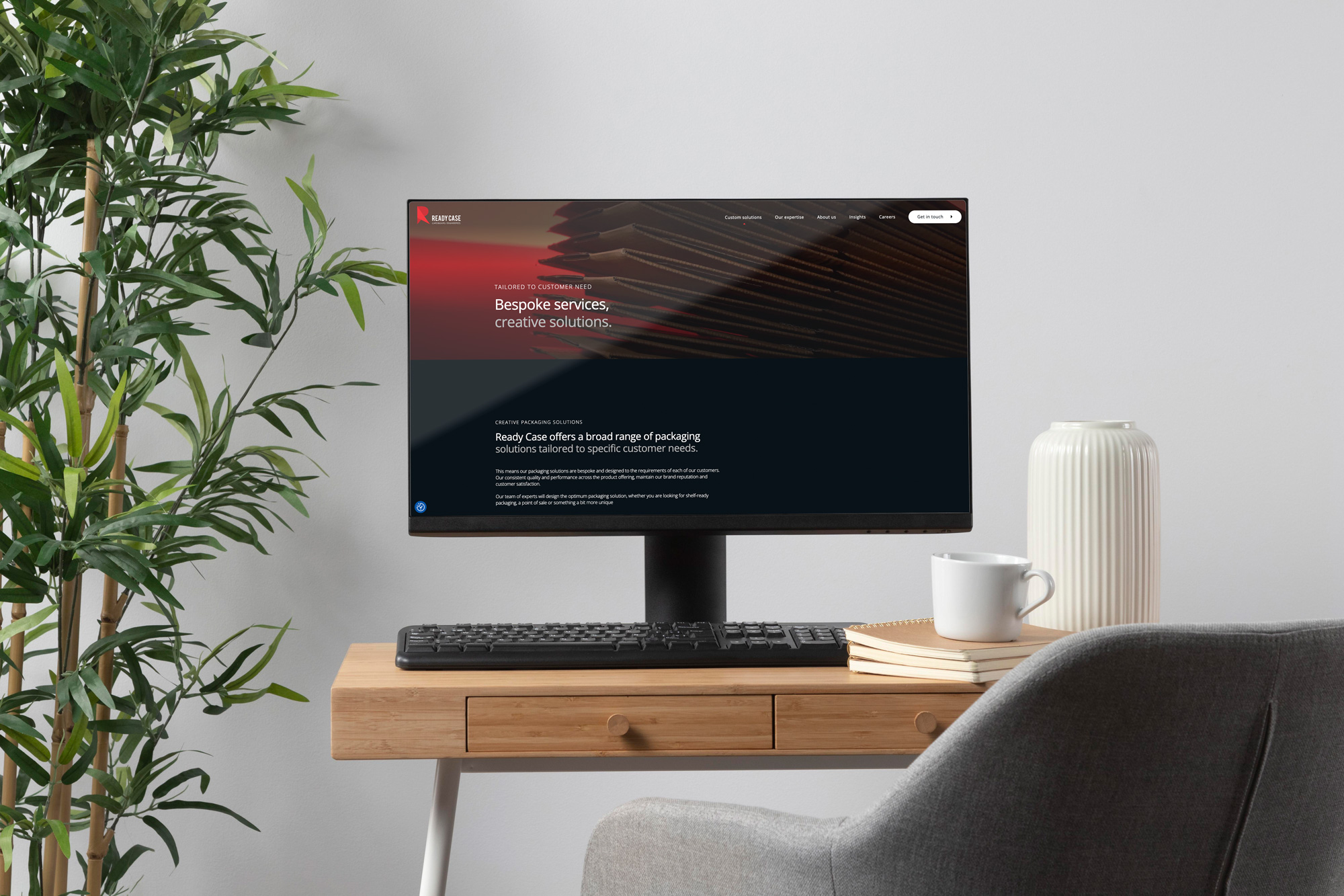
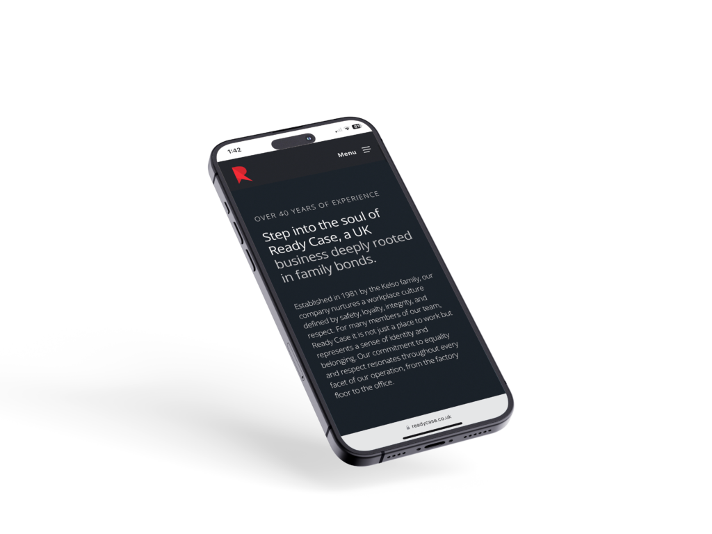
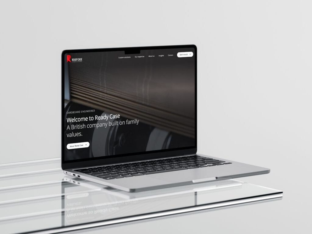
    Our design team focused on creating a sleek and contemporary look, using a clean layout that emphasises Ready Case’s premium products. High-quality imagery and engaging visuals highlight the craftsmanship of their packaging solutions, while carefully chosen typography and colour schemes reflect the brand’s identity. 

    The new website for Ready Case looks great and functions flawlessly, providing an engaging and intuitive experience for users. Key benefits of the new site include: 

    • An enhanced brand image: The modern design reinforces Ready Case’s position as a leader within the packaging solutions industry. 
    • Improved user engagement: With streamlined navigation and responsive design, visitors to the website can explore the extensive range and view the business’s expertise. 
    • Boosted sales potential: Prospective customers can quickly review their packaging solutions, whether this be customised or, their popular ReadyLoc and ReadyPac options. 

    We are proud of our collaboration with Ready Case and the fantastic results achieved with their new website. This project underscores our dedication to delivering bespoke digital solutions that empower businesses to thrive online. 

    If your website needs a transformation or you’re looking to create a new online presence, let’s talk! 

    Visit ReadyCase.co.uk to see the new website in action, and contact us today to start your digital transformation journey. 

    previous Post

    2024 Wrapped: A year at Resolution

    next Post

    The Impact of AI on Marketing: What Changes Will 2025 Bring?

    let's get the ball rolling

    start your project

  • Our Recent Work With Gaiger Bros

    22.10.24

    Our Recent Work With Gaiger Bros

    by Becca

    3 minute read

    Gaiger Brothers new website mocked up on a desktop screen.

    We recently had the pleasure of designing, developing and launching the brand-new website for Gaiger Bros, a reputable family-owned construction business based in Devizes, in the heart of Wiltshire. 

    Gaiger Bros deliver high-quality building services and are well known throughout Wiltshire and beyond for their craftsmanship and commitment to excellence. With their continued growth within the construction industry and more recently the development industry, they needed a revamped online presence that truly represented their values, experience and expertise, and that’s where Resolution stepped in. 

    We have been working alongside Gaiger Bros for many years and understand the key aspects of their business, transforming their digital presence to create a clean, professional and highly functional website that highlights the history of Gaiger Bros while embracing modern design principles. Gaiger Bros phone

    Our main goal was to create a visually engaging and intuitive website that communicated the Gaiger Bros’ core services, portfolio and deep-rooted expertise in the construction industry. 

    The new website needed to:

    • Showcase the impressive portfolio of completed projects, and highlight projects still in progress 
    • Provide an easy-to-navigate user experience (UX) 
    • Reflect the brand’s history, values and professionalism 
    • Incorporate responsive design for accessibility on all devices 
    • Enable easy contact options for potential clients 

    Since Gaiger Bros have been in business for over seven decades, highlighting their rich heritage was key. The website introduces visitors to the company’s story, starting from its founding in 1945 to the present day. This was achieved through strategic content placement and visual elements such as images from previous projects and using testimonials to enhance the legacy of craftsmanship. 

    It was also key that our design team understood the target audience of Gaiger Bros, which includes potential clients in both the residential and commercial sectors. We focussed on building a user-centric design to meet the needs of visitors looking for detailed information on previous projects and services. 

    By simplifying the site architecture, and making the overall navigation seamless with clear categories like “Construction” and “Development”  for users to quickly access relevant information, the result is a site that is easy to browse and visually appealing. 

    Gaiger Bros New Website!

    An essential component of this site is the project portfolio section, where Gaiger Bros can showcase their diverse range of completed projects. This section was designed to ensure that each project is presented in detail, with high-quality images, descriptions and relevant technical information. We developed a flexible grid that allows the team to seamlessly upload new projects, maintaining a consistent look across the portfolio.

    Along with focussing on the overall website aesthetic and functionality, we also integrated search engine optimisation (SEO) best practices to enhance the brand’s visibility online. From keyword optimisation to technical SEO improvements, such as clean URLs, the site was built to rank well in search engines, bringing organic traffic to the site. 

    By focusing on clean design, optimised performance and user-centric functionality, we have created a platform that showcases Gaiger Bros’ expertise and enhances their credibility in the competitive construction industry. 

    The brand-new site is now a valuable asset for attracting new clients and highlighting the company’s long-standing tradition of excellence. 

    The partnership between Resolution Design and Gaiger Bros is a testament to our longstanding relationship, the power of collaborative design and the impact of a well-thought-out web strategy. 

    If you’re looking for a revamped website or strategy, reach out to our friendly team today to get the ball rolling. 


    previous Post

    New website alert!

    next Post

    Designing the new SaySomethingin language learning app

    let's get the ball rolling

    get in touch

  • New website alert!

    02.10.24

    New website alert!

    by Becca

    2 minute read

    The mobile homepage for the new website for Resolution Design

    We’re thrilled to announce the launch of the new era of Resolution Design!

    While our team has been busy finalising client projects (watch this space!), we’ve also dedicated time to designing and developing our website.

    After months of hard work in planning, designing, and perfecting, our refreshed online presence truly embodies who we are and what we offer.

    The redesigned site aims to provide visitors with a more intuitive and engaging experience, featuring a sleek modern look and improved functionality. Navigation has been enhanced, making it simpler to discover our diverse services, including branding, web design, digital marketing, and strategic solutions.

    Whether you’re a small enterprise or an expanding brand, our portfolio highlights our dedication to delivering high-quality, results-oriented design. We encourage you to visit, explore our projects, and find out how we can support your business’s growth with creative solutions tailored to your objectives.

    Keep an eye out for new content, expert insights, and exciting projects.

    Welcome to the refreshed Resolution Design!

    previous Post

    Benefits of a UX Audit

    next Post

    Our Recent Work With Gaiger Bros

    let's get the ball rolling

    get in touch
  • Our recent work with Woods Valldata

    17.01.24

    Our recent work with Woods Valldata

    by Emma Heart

    1 minute read

    Woods Valldata brochure

    2024 will mark a decade-long working relationship with charity fundraiser provider Woods Valldata.

    We’ve delivered numerous projects large and small for the Wiltshire-based business including its main website in 2015, brand development and guidelines in 2022, and most recently the creation of office interior graphics and its new website.

    What did we do?

    We refreshed the website to improve the customer journey and developed a corporate identity harmonising with the business’s position and core values.

    We continue to manage ongoing digital marketing activity, including Google ads, digital reports and print materials, as Woods Valldata aims to keep most of its marketing under one roof.

    What did the client say?

    “The process of working with Resolution Design on the brand was enjoyable. They quickly created a comprehensive brand which we have applied across multiple media. 

    Resolution also helped us create our new website and they pulled out all the stops to ensure the site was up and running within our tight deadlines. I consider Resolution an extension of our company – providing design services that we cannot deliver in-house and working with us collaboratively to deliver our aspirations.” 
    Helen Halahan, Marketing & PR Manager

    Woods Valldata partners with over 100 charities including Age UK, Battersea Dogs & Cats Home and St. John’s Ambulance, helping them raise funds by ensuring their supporter experience is the very best it can be across services such as weekly lottery, response handling and direct debit management.

    In 2022/23, it processed £175 million in payments and banked £36 million of prize-led income.

    View the full case study on our website now, and get in touch if you are looking for a marketing agency that can help transform your business marketing.

    previous Post

    Can you be credible using an email without a business domain?

    next Post

    Battle of the brands

    let's get the ball rolling

    Get in touch
  • Can you be credible using an email without a business domain?

    19.12.23

    Can you be credible using an email without a business domain?

    by Richard

    2 minute read

    coffee and phone

    If you have a small business you may be using, or have used, a modified personal email as your business email. For example, the business ‘Top taps’ may use [email protected] or [email protected]. Businesses that do this are almost always businesses without a website, a website being the primary reason for having a domain name.

    Buying a domain name for just your email

    Not having a business email will not doom your business to failure, but it’s not a positive signal to your customers. To be credible your business needs a suitable domain name and at least one professional email. The good news is that obtaining a domain name and business email is simple and inexpensive. As part of our hosting here at Resolution, we can provide a domain name and professional emails as part of our managed service for as little as £44 a year. If you’re happy to manage the process yourself you can go to a domain and hosting company and they will give you the ability to purchase both for potentially a little less.

    Do you need a website too?

    The vast majority of businesses have websites these days, but some small businesses still don’t, limiting their online activity to social media like Facebook and business directories. This is quite common in the building trade, where sites like checkatrade.com, trustatrader.com, mybuilder.com and myjobquote.co.uk are very influential and can provide regular enquiries.

    If you don’t have a website and you’re wondering if you should, consider what a potential client may think if they can’t find a website for you, but they can for the competitor they were also thinking of using. Again, credibility is key.

    If you’re looking for an inexpensive starter website several companies specialise in self-build solutions, for example; Wix, Ionos, Go Daddy, and Squarespace. If your time is precious and you’d like professional help, including bespoke design and build, then we’d love to hear from you.

    previous Post

    The importance of Cyber Essentials Certification

    next Post

    Our recent work with Woods Valldata

    let's get the ball rolling

    Get in touch
  • Evolution of a website… the success of Future Proof Insurance

    04.10.22

    Evolution of a website… the success of Future Proof Insurance

    by Richard

    2 minute read

    Father and Son Walking Together Holding Hands

    It’s been a while since we discussed our work in a post, so I think it’s time… the topic is website evolution and I’ve chosen Future Proof Insurance as the example, a client for over 10 years.

    Future Proof are critical illness, income protection & life insurance specialists, often helping clients who find it challenging to get insurance through more standard policies. Founded in 2011 they have had a somewhat meteoric rise, growing rapidly in the early years, winning multiple awards (which they still do on a regular basis) and being noticed and subsequently purchased by St James’s Place Wealth Management in 2019… impressive.

    We find that most clients need a new website every 4 years or so and we created new sites for Future Proof in 2011, 2015 and 2022. So let’s go back to 2011, having created their logo we used the website creation process to explore design directions, settling on a friendly, approachable style and wildlife imagery including families and groups of animals. It proved to be a very successful brand direction and gave them a clear point of difference against their competitors.

    2011 proof of the website homepage design for Future Proof
    The original 2011 proof of the website homepage design, complete with lorem ipsum content.

    It’s worth noting that this first site was a fixed-width site, designed for desktops, which was ideal for their users. Attractive and comprehensive, the site included 2 separate navigations for ease and a simple quick enquiry.

    By 2012 the technology for creating mobile responsive websites was becoming more accessible, removing the requirement to have a fluid site or a separate mobile-only site. This change in technology gathered pace as smartphones and tablets became more common and user habits shifted to using a variety of devices. By 2015 it was a priority for Future Proof to have a fully responsive website.

    2015 Future Proof website
    The 2015 responsive site, using WordPress as the CMS platform.

    The 2015 site was a customed designed site (in common with all our sites) and used WordPress as the Content Management System. Consequently, it was extremely scaleable and Future Proof created an extensive library of blogs and articles to help with search engine ranking performance. The site also included the ability to get an instant quote online, an important new development.

    By 2022 the fundamental requirements for the site had not changed, but new technology opportunities had emerged, the site needed content reorganisation and it was time for a brand style update. The animal imagery had served them well, but it was time for a more sophisticated look and feel.

    The 2022 Future Proof website
    The 2022 Future Proof website

    Launched in August, you can take a look at the new Future Proof website and see the next evolution of their site for yourself. You may want to check out their insurance products and get a quote, after all, they are a multi-award-winning business.

    previous Post

    Why is a story so important?

    next Post

    Is AI poised to change the way we write?

    let's get the ball rolling

    Get in touch
  • 15 years of professional website hosting

    26.07.22

    15 years of professional website hosting

    by Richard

    2 minute read

    Light dancing

    When we’re discussing the creation of a new website it’s common for the site hosting to be an afterthought. It rarely gets a great deal of consideration beyond ‘yes, we need that’ or ‘what do we need that for?’.

    All websites need hosting, they need to exist on a server somewhere. When someone visits your site, they are directed to your hosting so that they can access the pages, downloads, videos etc. So your hosting has a direct bearing on the experience your visitors receive. Your hosting should deliver your website quickly and securely, 24/7. Any server has only finite resources, if you overload those resources things start to go wrong. Adequate storage capacity, processing speed and bandwidth are key to consistent and fast site delivery, as is first-class security.

    We started hosting websites in 2007, back then sites were generally quite simple and there were limited hosting options. Most sites were on ‘shared’ hosting, meaning they were sharing a server with other websites. Things could go wrong if the server resources and security were not carefully managed. Some companies hosted their own sites, on their own internal servers, which was unusual. The majority of companies used fast-growing hosting companies to host their websites, often going via professional hosting partners like ourselves.

    These days almost all websites are hosted by professional hosting companies, who take server space in large data centres. Shared hosting is still common, but other options exist, including Virtual Private Servers (VPS), which are dedicated areas within larger servers.

    Over the years we’ve evolved our hosting service, finding the best hosting companies to partner with and providing a completely managed service to our clients. We take all the headaches away, ensuring you have the most appropriate hosting for your requirements, backed up by our proactive, friendly service. We host hundreds of business websites, we also provide domain name registration and business email services. We are also WordPress website hosting specialists.

    For more information about our hosting services please see our hosting page and for further information please contact us.

    previous Post

    Recharge your motivation mojo

    next Post

    Why is a story so important?

    let's get the ball rolling

    Get in touch
  • Recent website launches

    09.03.22

    Recent website launches

    by Richard

    2 minute read

    Bex Design & Print Website

    We’ve had a very busy start to 2022, working on a broad range of projects including branding, websites, graphic design and regular ongoing digital marketing. Much of this work has been for clients going through our very successful Accelerator process, the 3rd stage of which is website creation, and it’s this aspect of our work that we’re showcasing in this blog.

    Three sites we’d like to share with you that launched recently are; Watches of Bath, Bex Design & JPA Technical. All these sites were created using our proven website creation process and use WordPress as the CMS. WordPress is our go-to CMS for business websites and we have a great deal of experience both creating and supporting WordPress websites.

    These businesses are very different from one another and the websites reflect this. This creative diversity is possible because all our sites are designed and built on a custom basis. We don’t use pre-designed themes, we design and build each site on a bespoke basis.

    Watches of Bath

    Based in the world heritage city of Bath, Watches of Bath sell pre-owned luxury watches. This e-commerce website is the hub for all their marketing activity and has a range of beautiful timepieces for sale. The site used WooCommerce with some custom components, including a sliding price filter and the option to pay a deposit or to pay in full. The site also includes a custom Collection section, where users can create an account and save any watch that they own, or that would like to own, and put them in their ‘Watch Box’. This way, Watches of Bath can help users achieve their dream collection.


    Bex Design

    Based in Wiltshire, Bex Design are highly regarded industrial printers, specialising in the design and print of membrane switches, graphic overlays and other printed materials. We have been working with Bex for many years and the new website is the 2nd site we have created for them. This comprehensive B2B website is designed to give clients a clear idea of all the products and services they offer, to perform well in search and to be a hub for their digital advertising and other marketing activity.

    BEX DESIGN WEBSITE

    JPA Technical

    JPA Technical supply industry-leading SAP and U-Value calculation software for the UK construction sector. After completing the branding, we then designed and built their new B2B, e-commerce website earlier this year. With a completely new look & feel, the site delivers a clear and compelling user experience and allows clients to purchase their software and training with ease.

    jpa technical website

    If you’d like to know more about how we create unique, compelling business websites please get in touch.

    previous Post

    Back to the studio

    next Post

    The rise of Google Ads and why you should use them

    let's get the ball rolling

    get in touch
  • Design psychology – 6 tips to improve your website

    14.10.21

    Design psychology – 6 tips to improve your website

    by Richard

    4 minute read

    Eye

    Did you know that our brains rely heavily on mental models and patterns, taking shortcuts to minimise thinking time? Put simply, we all make unconscious assumptions, particularly when it comes to the vast amounts of visual information we have to process.

    That’s why having an understanding of design psychology in marketing is handy: it allows us to design for minds on auto-pilot. Here are 6 useful tips you can apply to improve your website for our effort-averse brains.

    1. Keep it simple

    When people land on your site they want to know, very quickly, who you are and what you do, so tell them. Be clear with your message and ensure you position your business effectively. It’s no surprise that research confirms that clean, minimalist websites are often the best performers.

    Straightforward navigation – from menus to drivers – coupled with crisp copy and a consistent visual identity will help deliver journeys that customers (specifically their brains) enjoy.

        roebuck

    Also, consider the principle of proximity. We perceive objects clustered together as being related to one another, so ensure that related items are grouped and also, importantly, leave plenty of space between content that is not related. Designers love white space for a very good reason, it’s breathing room for our brains.

    2. Use compelling imagery

    This tip is no surprise, after all, a picture paints a thousand words. Images act as instant storytellers, they can powerfully communicate emotion and thought in no time at all. You can capture your customers’ attention by using a well-placed, attractive image.

    Visitors to your website will ‘read’ the images and in a split second, make a decision whether or not the rest of your website is relevant to them. So take your time to find high-quality imagery that not only communicates what you want but also sends the right messages about your business.

    hug pet food

    3. Contrast, colour & CTAs

    Using pops of colour and designs that utilise contrast is important for a brain-friendly website. According to the isolation effect, when we are shown multiple objects, the one that stands out is the one we’re likely to remember.

    When faced with designs that lack visual contrast, we’re less likely to remember vital aspects. Making useful information distinct via differing colours, positioning, size, and shape can help it to be absorbed more easily.

    CTA example

    When it comes to the all-important Call to Action (CTA) buttons; ‘contact us’, ‘buy now’ or the ‘free 14 day trial’ shown in the zPlan site above, there are some broad colour rules. The best colours for CTAs are those that tend to evoke positive emotions. Red, green and orange are considered good colours; red evoking urgency, green being reassuring and orange being warm and happy. Less good colours, the more emotionally passive colours, are white, black and brown.

    4. Content hierarchy and the F-shaped path

    Eye-tracking studies have shown that when we browse a website for information, we often scan in an F-shape. We start at the top, shift to the right, then sift downwards, searching the page for useful imagery or text. Try to avoid putting key information at the bottom right of a page – most visitors are less likely to reach it.

    Also, consider content hierarchy. Your average visitor will only read roughly 20% of your web page, so make sure you communicate the important things first, your key content needs to be top of your page with strong visual prominence, you can then move on to the ‘detail’ later, for those more patient visitors!

    You can also break up the content of your pages to make them more scannable using:

    • Carefully crafted subheadings
    • Thematically ordered paragraphs
    • Bolded keywords
    • Lists
    • Columns

    5. Pair words with images

    According to dual-coding theory, a blend of verbal and non-verbal information makes it easier for us to remember data. Verbal information and non-verbal information are sorted using different cognitive systems, so communicating information to both systems helps people shape correct mental models.

    print design - resolution

    6. Embrace centre-stage

    When we’re shown a range of similar items, we tend to prefer the one in the middle – this is called the centre-stage effect. This is a beneficial concept to consider if you’re designing visuals to promote a product or service – be it in email marketing, on your website, or in an ad.

    If you’re trying to drive the sale of specific items or services, curate your website journey accordingly. For example, a promotional shot could feature several products, carefully positioned around a central item – the one you want customers to gravitate towards.

    Did you make it…

    If you made it this far down the post, your brain is in excellent shape, great job! You did so much better than those cognitively idle so and so’s who only read 20%, scanned the rest in an F-shaped pattern and looked at the pictures… 🙂

    previous Post

    The power of good positioning

    next Post

    The most overlooked marketing idea?

    let's get the ball rolling

    get in touch
Previous Page
1 2 3
Next Page

Address

58 Northgate

St Devizes

Wiltshire

SN10 1JJ

01380 728898

  • Instagram
  • LinkedIn

Services

  • Branding
  • Websites
  • Graphic Design
  • Digital marketing
  • Web Applications
  • Hosting & support
  • Marketing consultancy

Links

  • Careers
  • referral partners
  • login area
  • Code of ethics

Products

  • Email marketing
  • subzapp

© 2025 Resolution Design Ltd

Company reg no. 6510726

VAT no. 653 981 894

Sitemap

Legals